A NEW CUBBIES WEBSITE
I’ve been working on a new design and brand for the past seven months. I wasn’t happy with the last website as it was clunky and slow, filled with growing pains and the icons and colour tone looked dated. So what do you do when you feel like you want a change but don’t know what to change to? Just like you would looking for a new kitchen, you look for something you really like and say “I want mine to look like that!”
There is a children’s book company that I really like. Although totally different product, they also do a form of personalisation and they gave me great inspiration to incorporate what they do so well, in to Cubbies. Kind of…
I look at their website and took in to account:
• How simple it was to understand what they did and sold
• A visualisation on the product with 15 seconds
• The ease of the checking out process
• The colour tone, effects and subtle illustrations
• The quirky and distinctive characters
• The vibrant and fun language used
• How they told their story and what a joy it was to read
That’s what I wanted for Cubbies. I’m not stealing anything; I’m taking ideas and inspiration. I’m looking at alternative processes and tools used to see how I can put it all into a new Cubbies brand.
I did the same thing when I thought of the Harlequin collection. I was in China, saw a quirky stall that I liked and they had these different type of stuffed animals; very modern and hip. They looked nothing like a Cubby but the way the fabric and patchworks were used I though I could ‘Cubbynize’ it (that’s one of my made up words).
So where to begin? Potentially, the hardest part was finding the developers to build it. However, I managed to make this one of the easiest. I didn’t do a Google search for “Web developers” or anything vague like that, or asking for referrals or searching for pictures of peoples work. I simply put in the name of the website I liked and scrolled through to the second page until I found a testimonial done for the media company that made it. So simple.
From there it was a case of telling them that I liked what they did for that website and how could we implement it for Cubbies?
This was a ‘real’ media company. There are thousands of web developers that are all the same, using a standardised template where they send all the coding to programmers in India and take weeks to get back to you regarding updates. I refused to have that and made a large budget understanding that you get what you pay for and I wanted to get something special and unique.
Two things they wanted to point out to me was the characters we were using, and the complexity we were offering regarding the Birth Block design tool.
1. The characters are done in vector with strong colours (saturation) and needed to be redone via a proper artist. Fortunately for us, we have a fabulous illustrator in house who does all our designing and he was very keen to come up with some new stuff.
2. The conversion rate to the website was miserly. We experience what a lot of you guys experience and wanted to get to the bottom of it. They suggested there was too many options and those options was making it too slow.
Note: Cubbies is 99.8% wholesale (B2B) but we are trying to close more consumers who come to us directly for a Cubby in which we outsource the embroidery to one of our customers in the UK. If people were to Google Cubbies the chances are we would be the first hit so I want all potential customers to be impressed so the products and the brand feel. I also want to set a high pricing guideline to increase the perceived value.
Characters
We didn’t want Disney – but we wanted the designs to look like the Cubbies. Our web developers, going down the route of the children’s book website I loved, wanted to go down a quirky, unusual construct, more like a story book. Our complaint was that the designs should look like the product people want to buy, but we didn’t want Disney. Hence the dilemma.
Here are our illustrators initial designs:

Then the web developers gave us a very tight brief on what designs they think we should use, including tone and gradient. Here are our final character designs:

Everyone in the office preferred the original designs that looked liked the Cubbies. But my web developers were adamant on the storybook look. Accepting the fact that they were the experts in brand design and I was hiring them for the expert work and opinion, I went with their recommendations.
I’m very happy with the result

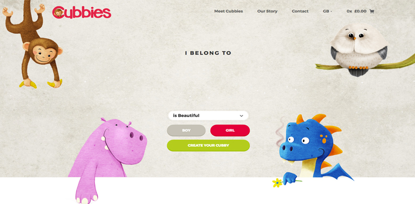
One problem a potential customer has is understanding what we do and sell within the first five seconds of landing on the website, because that’s how long we have them for before they filter out. The goal was to show the consumer an example of what they could get within 10 – 15 seconds of landing. We didn’t want the user to be looking at things to click on to get more info, it should be simple and staring them in the face. Something we have set up with Embelli software (wait for next months blog)
So we came up with the embroidery design of “I Belong To” I’ve always liked that idea when I first saw it in 2013. Even though the Birth Blocks are a lot more popular we want to test the idea of entering as fewer options as possible. We are not letting them choose colour or font or add any pretty images, and, even more unusual, we’re not even giving them the choice of Cubby – we are choosing it for them.
Shoppers are indecisive. The more options you give them the more options they have to say no to, and psychologically they fall out of the ‘impulse buy’ mind-set. We don’t want that.
The design idea that my developers came up with was characteristic. “What is the characteristic of your child?”
Is he a brave lion?
Is she a sweet little lamb?
Is he a cuddly bear?
Is she a playful tiger?
It was unusual but unusual is also unique and I’ve always gone down that road and it’s benefited me tremendously.
We give the option to the user on changing the Cubby to an alternative but it’s only the classics – all the others, including Dumbles are gone, for the purpose of simplicity and reduction in choice. Will it work? I don’t know, but if it does I will gladly show you results that you can use to improve the conversion rate on your own website.
Remember, Cubbies is not an embroiderer, that’s where you come in. We design Personalised Childrens Toys and we’re not looking to steal business away from you – we’re trying to promote a brand that people recognise and look for the best ways of converting customers with an online sale.
