

2018 Catalogue Creation
As they say, or don’t say, a new year, a new catalogue and here at Cubbies we’re no different. This year, we wanted to do something different and take a more simplistic approach to the new catalogue to really highlight the products and showcase everything we have to offer. So how have we done this, I hear you ask? Well, we have used a really simple palette consisting of mainly monotone colours. The text used in the catalogue perfectly reflected our branding and suited the theme that we’ve created for this year’s catalogue. We opted for simplicity and elegance and achieved this with the minimalistic page backgrounds and product shadowing. This helped highlight the products and show that they were the forefront, which would immediately grab the viewers’ attention.
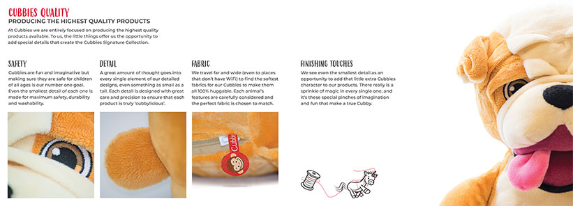
In addition, we really wanted to emphasise the quality of the Cubbies in this catalogue, so we have dedicated pages which show the process of making a Cubby and all of the fine details included within each one. Furthermore, despite the minimalistic approach, we wanted to make the catalogue look as fun, creative and inspiring as possible so we used a variety of images and illustrations to achieve this.
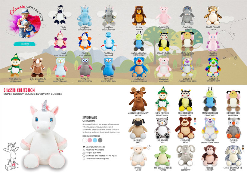
If you’ve already seen our new 2018 catalogue, you’ll notice that it is much different to last year’s. In the 2017 version, you can see a Cubby Island on every page, whereas on this years we have opted for a simple white background. We found this to be more effective at captivating the viewer and drawing the eye to the main focus of the catalogue, the products. This time around we wanted to include a little more information on each collection and also highlight specific products to give an insight into which are best sellers for us. This also gave us the opportunity to provide a more in-depth description of these Cubbies. Of course, the more spacious design and extra information included has meant a lot more pages. For this reason, we thought it was important not to over-face the reader, and so included colour variants to keep the number of products to a page at a minimum.
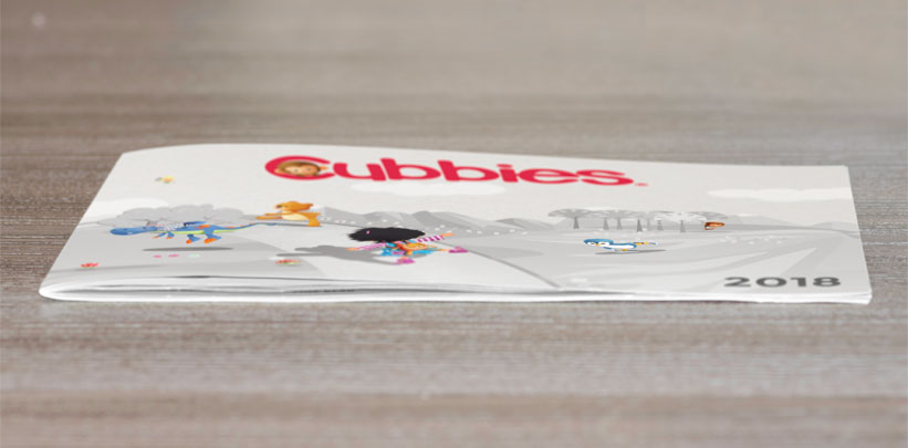
Also, in spite of the simplistic approach, we did keep the wonderful Cubbyland cover from last year’s rendition, but we made it monotone and added sprinkles of colour to focal points including, most importantly, the product illustrations and Cubbies logo.
This newer branding style has allowed us to get creative with other elements of marketing within Cubbies, like the mail-outs. We have completely redesigned the layout, banners and the images that go on to them which has reinforced our branding and made both the catalogue and the weekly emails perfectly intertwined.

Creating this year’s catalogue was a fun, but challenging task. First of all, we had to plan out the exact style we wanted to go for. We held meetings and brainstorming sessions between the marketing and design team to collaborate on the direction we would take this year. Once we had concluded this meeting, we started looking over our previous catalogue. We went through every single page and made notes, where relevant, of things to change or reposition.
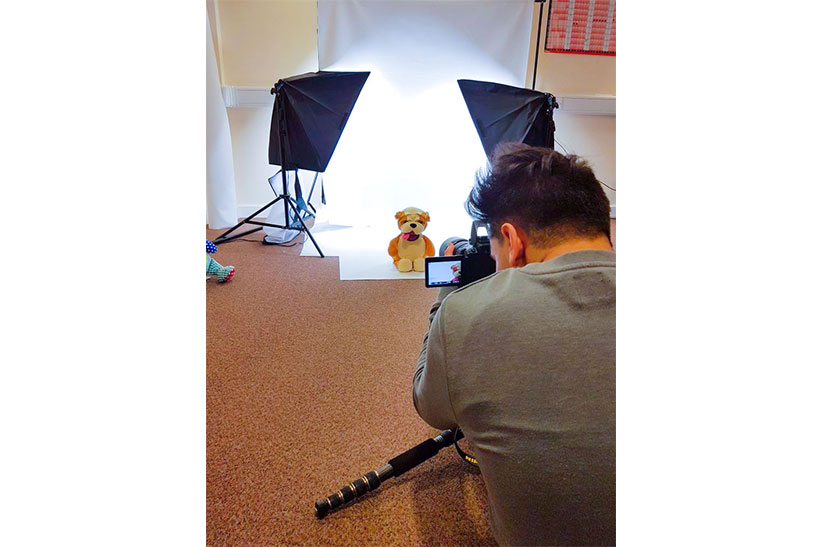
Once we had an annotated catalogue, we started creating a new template for our 2018 catalogue. Then we got to the fun part, designing the catalogue and taking the photos. We each had our own separate areas of the catalogue to work on. First of all, the catalogue’s design. This was where Bee operated.
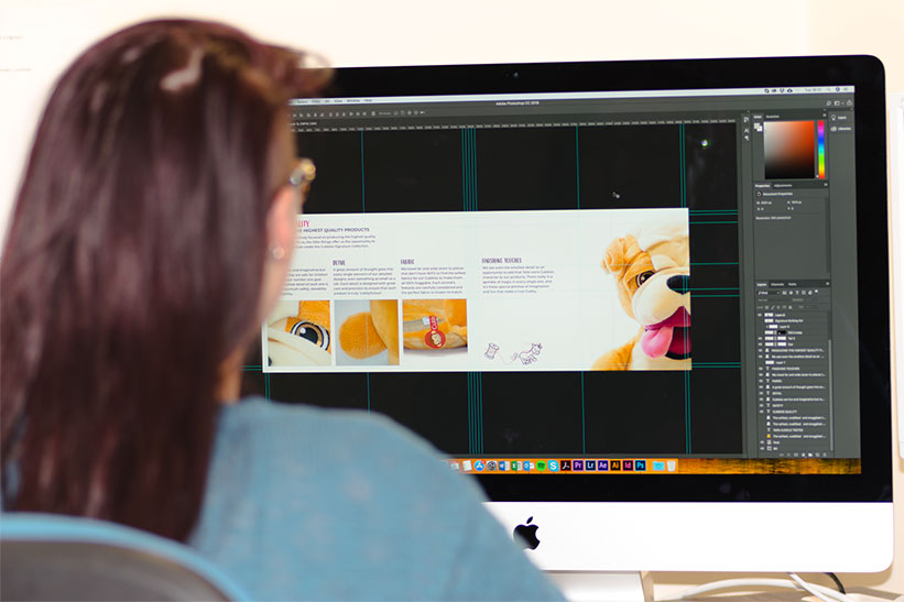
I worked very closely with Bee as I was taking the photos for the catalogue, so I needed to know what was going where, how big it needed to be and how it needed to look. Once Bee had created the basic design of the catalogue, I started taking some photographs to complement it. I set my camera to manual settings and kept everything consistent throughout the photography process.
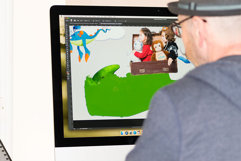
After I had taken the photos, I took them to the editing studio (my computer :) ). All I did during this process was lighten the images up a tad and make any small additions to make them look more real to life. Once all of the images were edited and looking beautiful, Bee added them into the catalogue along with the illustrations produced by our design team.
Finally, Bee added any final touches to the catalogue to make sure it looked ‘cubtastic’.
Overall, we are in love with the new look and feel this year, we think it highlights the key features of each collection and we hope you agree :)
Hi there, just wondering if you send catalogs out or are they just online, many thanks
Hey, absolutely. We will have hard copies available soon. Please contact customer service if you would like one. :)
Hi there how do I open a account and what’s the min spend please
Hi Mandy
Please go to http://www.cubbies.co/wholesale, from here you will be directed to an enquiry form. Once we’ve received your submission your prospective Account Manager will be in touch. There is an opening order minimum, which can be discussed with your account manager.